top of page
 |  |
|---|---|
 |  |
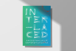 |
INTERLACED ALPHABET
This alphabet was inspired by a structure of geometric lines that are individually arranged to specifically compose each letter. A sans-serif font was created as a starter point. The working area was a 4 x 4 inches that allowed predetermining a standard width of 1 inch for the stem. For a more precise look, the working area was kept into a grid of small 0.25 x 0.25 inches squares. The W is the only letter that does not agree with the established square working area of 4 x 4 since this letter requires a wider space to be appropriately constructed. Nevertheless, the affiliation to the other letters is still present when the width of the stem is still the same.
bottom of page